Well then, it seems e-poetry can really give you a visual of your own mental state. This is a pretty intriguing concept, and one I’ll have to experiment with in my writing in the future.
For this week, I wrote a poem called Inferno. The underlying theme for Inferno isn’t some deep, complex mystery (I’d like to claim that I’m so brilliant with English and computer skills that I could have written a rival for Homer’s Odyssey on my first shot but sadly this is not the case)- it references a struggle with rage and hatred that I have had to deal with for years due to a certain individual’s betrayal of my entire family, which altered our lives in ways we could never have imagined possible. I hated this person for what they did and still do to an extent- even though I have always been against having such feelings about anyone and I know it’s wrong (personal conviction, not admittance to some social taboo) , it has just been unavoidable for me. The thing of it was that it wasn’t an explosion that never died down, as with a sun; instead, it crept in slowly, affecting my mental processes like an evening mist, and continued to sink its way in until I finally realized that I was carrying a giant ball of hatred within me.
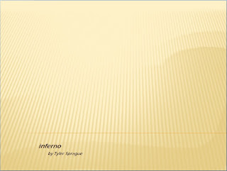
I convey these ideas in the poem through the positioning and font of the text on each page. Starting with the title page, “Inferno” is written in all lower-case letters and in a small font but bolded, meaning that such a disastrous mindset can spark below one’s notice.
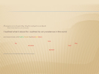
 For the first actual page, I put the first two lines in small fonts to illustrate the silent debut of the inferno, with the first being in the elegant Blackadder font (the only fancy font I could still read accurately) for its ghostly entry. I followed this up with a relatively huge line, which strongly enforces the ideal that was sometimes the only fact I was able to hang on to- that I hated the inferno’s existence. The conclusion of slide one describes a forest (my cheerful disposition toward life) being slowly destroyed and parts of my heart being lost.
 Slide two starts off with my belief that what one invests their time in carries a bit of their heart in it by having the first line “carry” the second one, which trails behind it. Simple color combination illustrates the inferno and I melding into one and the end lines that describe my frustration with myself only worsening the problem, highlighted by the middle line that basically screams at the reader.
 The final slide in my opinion lacks a bit in creativity but was the best I could come up with given the content. In this slide I acknowledge that the inferno will one day die, which is why there is a change in the background- a dead fire and the destruction it leaves in its wake doesn’t necessitate a blindingly bright backdrop. Using color changes with the text, I make the transition from the fire’s death to the salvage and regrowth of whatever of my heart was destroyed in the fire and giving new life to the forest that was lost to it.
I’ve had some previous experience with the PowerPoint program, so creating this slideshow wasn’t an impossible task for me, but my inability to access the deeper functions that are supposed to be there stifled my creativity. I wanted to, as I’ve said, do some tricky stuff with the text, like have the lettering of “wasting ticks” do something resembling time ticking by, that may have added to the poem’s message. Having said that, my experience with PowerPoint was otherwise fairly positive. I was able to figure out all the key functions intuitively- and even picked up a few new ones- with no help and with fading transitions, in my opinion, illustrate the rage and hatred I felt accurately.
- His Imperial Excellency Actorbass33 the Triumphant
For this week, I wrote a poem called Inferno. The underlying theme for Inferno isn’t some deep, complex mystery (I’d like to claim that I’m so brilliant with English and computer skills that I could have written a rival for Homer’s Odyssey on my first shot but sadly this is not the case)- it references a struggle with rage and hatred that I have had to deal with for years due to a certain individual’s betrayal of my entire family, which altered our lives in ways we could never have imagined possible. I hated this person for what they did and still do to an extent- even though I have always been against having such feelings about anyone and I know it’s wrong (personal conviction, not admittance to some social taboo) , it has just been unavoidable for me. The thing of it was that it wasn’t an explosion that never died down, as with a sun; instead, it crept in slowly, affecting my mental processes like an evening mist, and continued to sink its way in until I finally realized that I was carrying a giant ball of hatred within me.

I convey these ideas in the poem through the positioning and font of the text on each page. Starting with the title page, “Inferno” is written in all lower-case letters and in a small font but bolded, meaning that such a disastrous mindset can spark below one’s notice.
With the other pages, I wanted dearly to make the text do some special stuff- I saw a lot of really cool effects in class that I wanted to duplicate that would have given my poem a special edge and bring out the pain and rage I’ve felt over the course of the last few years. Unfortunately, I am not skilled with PowePoint in any way, and therefore spent a lot of time looking for text manipulation options that I simply could not find. In the end, I had to settle for simple manipulation of transitions and line textures/positions much as I did with the title page, which I personally consider to be boring in the face of all the opportunities I know I’m missing out on but in the end didn’t turn out too badly.
 For the first actual page, I put the first two lines in small fonts to illustrate the silent debut of the inferno, with the first being in the elegant Blackadder font (the only fancy font I could still read accurately) for its ghostly entry. I followed this up with a relatively huge line, which strongly enforces the ideal that was sometimes the only fact I was able to hang on to- that I hated the inferno’s existence. The conclusion of slide one describes a forest (my cheerful disposition toward life) being slowly destroyed and parts of my heart being lost.
 Slide two starts off with my belief that what one invests their time in carries a bit of their heart in it by having the first line “carry” the second one, which trails behind it. Simple color combination illustrates the inferno and I melding into one and the end lines that describe my frustration with myself only worsening the problem, highlighted by the middle line that basically screams at the reader.
 The final slide in my opinion lacks a bit in creativity but was the best I could come up with given the content. In this slide I acknowledge that the inferno will one day die, which is why there is a change in the background- a dead fire and the destruction it leaves in its wake doesn’t necessitate a blindingly bright backdrop. Using color changes with the text, I make the transition from the fire’s death to the salvage and regrowth of whatever of my heart was destroyed in the fire and giving new life to the forest that was lost to it.
I’ve had some previous experience with the PowerPoint program, so creating this slideshow wasn’t an impossible task for me, but my inability to access the deeper functions that are supposed to be there stifled my creativity. I wanted to, as I’ve said, do some tricky stuff with the text, like have the lettering of “wasting ticks” do something resembling time ticking by, that may have added to the poem’s message. Having said that, my experience with PowerPoint was otherwise fairly positive. I was able to figure out all the key functions intuitively- and even picked up a few new ones- with no help and with fading transitions, in my opinion, illustrate the rage and hatred I felt accurately.
- His Imperial Excellency Actorbass33 the Triumphant